
Cool props can make a regular photo shoot go from good to super fantastic wonderful AWESOME. Learn to make amazing signs that look great no matter what type of setting you choose. Then make them for your engagement session, for your wedding day photo booth, or even for your “thank you” cards!
What you need:
- Foam core posterboard (mine is ½ inch thick and 20″ x 30″)
- Utility knife (#11 craft)
- Utility knife (box cutter)
- Pencil, eraser
- Acrylic paint, one light color and one dark color (I used black and white)
- Thin paintbrush for detail work
- Thicker paintbrush for larger areas
- Ruler/straight edge (if you are doing the grid method of enlargement)
- Transparency projector, inkjet transparency paper and printer (if you are doing the projection method of enlargement)
Step one: design your sign
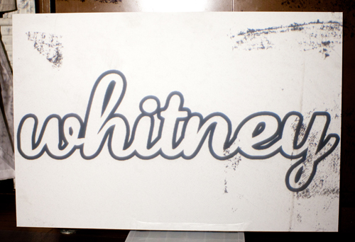
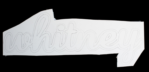
My web designer Kyla Roma helped me create a “whitney” sign for the new Whitney Lee Photography website that we're working on right now. But pardon me that my example sign isn't wedding related — it is all about ME! 🙂
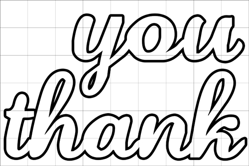
I did make a template JUST FOR YOU of signs that say “thank you” for those of you who don't care to design your own. You can download it here. You should be able to use this template regardless of which method of enlargement you choose.
 How to make photobooth save the date cards
Since the photobooth “save the date” cards I featured a while back were so popular, I figured it was worth sharing this video showing you... Read more
Some sign designing tips:
- Make sure the letters solidly touch one another, or at least their outlines do. If there is a thin spot your sign could bend or break at that point.
- The letters “i” and “j” may need to be modified so that the dot touches the rest of the letter.
- I recommending using lighter color letters with a darker outline color. That way your sign will stand out against a light background OR a dark background.
Step two: enlarge your sign design
There are two ways to do this, the grid method or the projection method.
The Grid Method
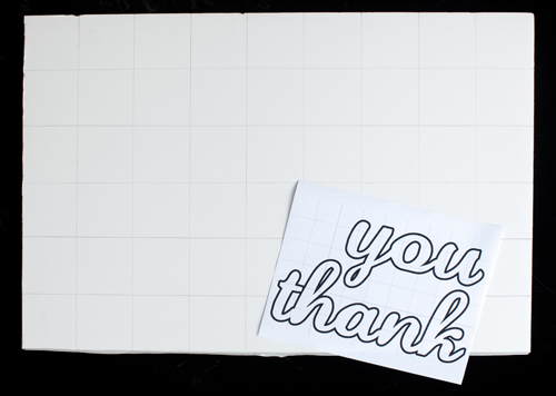
The more difficult yet more inexpensive and (and therefore more accessible) way is to overlay a grid onto your sign design and then draw a grid onto your foamcore. Use the grid as a guide to hand-draw your sign design onto your foamcore.
I used foamcore that is 1/2″ thick.

Measure your foamcore to determine the height-to-width ratio. My piece is 20″ x 30″ which is a ratio of 2:3. When I designed the “thank you” signs I made sure that my digital design had the same 2:3 height-to-width ratio. This is an important step so that you do not accidentally distort your design.
Next, draw a grid on your foamcore posterboard that matches the grid on your digital design. Use very, very light pencil lines! I drew them much too darkly on my example, but I needed mine to show up in a photo! 🙂 Light light light light lines!
Then hand-draw your image onto your foamcore, using the grid as a guide. It is helpful to look at only one square at a time and ignore the other squares. You may have a better time working with the lettering up-side down, that way it will be easier to see the lines as abstractions instead of thinking of them as lettering. Sounds crazy, but it helps with accuracy! If you are still having trouble (or if you're nervous before you even begin) you can make a smaller grid so you have even MORE guides to help you get it right.
Again, draw *very* lightweight lines!
The Projection Method
This method is *much* easier, but you have to have a projector! I own an old school classroom projector that I got from craigslist, but projectors are also available for purchase at most retail craft stores.
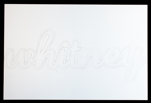
I print my “whitney” sign design onto transparency paper (be sure to buy a kind that is compatible with your printer) and project the design onto my foamcore, making sure the design stretches across the entire foamcore posterboard.
Then simply trace the design onto your board!
Step three: cut it out
Once the design is drawn onto your foamcore, it is time to cut it out! With the thick foamcore, this step takes lots of patience. First use a larger boxcutter-style utility knife to coarsely cut out your shape. Then use a smaller craft knife to cut out the more detailed areas. Think of it like carving or whittling, taking off little pieces of foamcore at a time until you get the shape that you desire. Also, change your blades often often often. Like a bajillion times! If it feels like you are tearing your foamcore instead of cutting it, that means it is time to change your blade.
Step four: erase unnecessary pencil lines
Once your sign is cut out, you just need to paint it. If you used the grid method to enlarge your design, use an eraser to remove the grid lines as much as you can. Even with the projector method I still spent a lot of time erasing unnecessary pencil marks.
Step five: paint it
If your foamcore isn't totally white on the white parts of the sign (the pencil marks aren't erasing completely), or if you are choosing to use another light color besides white, paint the light insides. I was able to get away with leaving the white parts of the “whitney” sign mostly paint-free. Once your light paint is dry, paint your dark outline. I painted the outline on the face of the foamcore AND I painted the edges. It looks really nice that way. I also had good luck painting the entire top of the outline and then l let it dry overnight and painted the rest on the following day. Otherwise it would be difficult not to get paint everywhere! Like the cutting, I used a small, fine paintbrush for the detail work and a larger brush to paint bigger areas. When I was finished with the black outline I used a bit of white paint to “clean up” my sign — I painted over areas where I could see pencil marks or where I accidentally got a little bit of black on an area that should be white.
Step six: pose and play
This is the best part!











Hey super cute idea!
Way easier than the grid idea is if you print your letters the size you want. tape it onto your foamcore, then trace the outside of the letters with something nubby- like a stylus or even the rounded end of a pen or cap- then you have the trace but without the pencil lines, just cut along the indentation.
(that’s how we make signs at my company)
Such a cute idea!
Or just spray mount the printed out letters onto the board, then you don’t even need to paint it. Unless you want the painted look of course.
Love this idea! And LOVE your shirt!!!! If you dont mind me asking where did you find that beautious shirt?!!?!? <3 Really in love with it!
I got it at Buffalo Exchange! It may be a skirt, hahahahaha! Hard to tell. 🙂
I want to subscribe to follow up comments if she responds to me! I forgot to do that 🙂
Oh should I have replied to this one? I replied to your comment above. <3
Or an even easier way… Take ur drawing to a photocopy shop and ask then to enlarge it. If u divide what size u want by what size u have then it will give u the percentage needed… Or most photocopy shops can work that out for u… Doesnt cost much either… I work in printing and we charge $2.40 each print… But thats in australia, dunno what usa prices are like
You could also use black-core foam core to define the edges even more. Dick Blick or wherever will have all different combinations of foam core for your crafting pleasure.
I painted the edges black to get the same effect. Still… black foam in the middle would be even better!
DOOD. Save the dates. AWESOME.
LOVE this! Thanks for sharing! I can think of several different ways I could use this in the upcoming months. <3
hi, I’ve done the ‘thank you’ for my wedding, but want to do some more words and I was wondering what font you used? I’ve been trying to match with what I have but it’s just not quite right.
Thanks for the template! I love it!
Roxanne
thank you …. i was trying to find a word i could use!!!!!!
Cute! What font is used for the name?
love it !! wonderful Idea