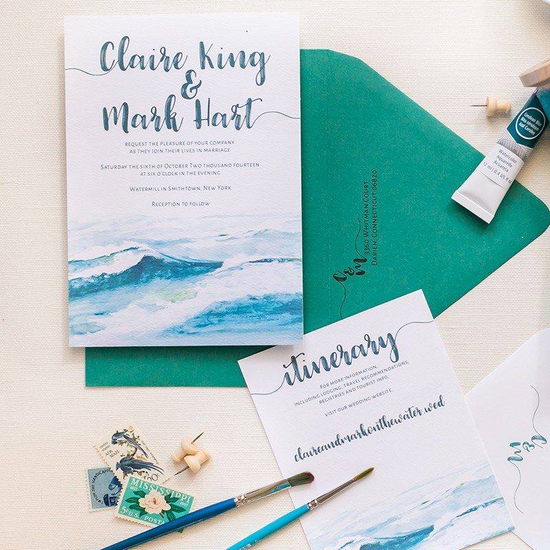
Invitation by CharmCat
Can you recommend any vendors who can create accessible wedding invitations for the sight impaired (as in large print, but no Braille)?My fiance's grandmother is legally blind, but has some sight and lives independently. I would love to find something that is professional and pretty which she is also able to read herself.
Thank you! – A
While there are lots of invitations designers who either already produce accessible wedding invitations or can easily customize them for you, my first thought actually went to a video invitation. If you, or someone you know or can hire, can whip up a video invitation that speaks the information (at least the major highlights of date, time, location, etc.), that might be one way to make sure your partner's grandmother can watch and re-watch to get the info on to her calendar. Alternately, a website (if she uses the internet) could also be a way to display the information in a larger format with high-contrast colors. Plus that format allows her to increase the size as much as she likes. But I digress. Let's talk paper!
If you select a small business or Etsy seller to create your invites, you're very likely to find one totally willing to customize something to your needs. We reached out to a few of our favorite vendors for their advice for finding/customizing beautiful, large print, and accessible invites for your inclusive wedding…

Invitation by BowerBox Press
Ashleigh with CharmCat:
Some of the easiest design choices for those with limited vision is to stick with simpler fonts with thick strokes (that means no bouncy calligraphy). Great readable fonts are Helvetica, Avenir, Alex, Futura, or other block-style fonts. You could use some italics or super simple script fonts for a little interest. Also stay away from all-caps, because you lose the “shape” of the words. Be sure to use a larger font size.
Color-wise, make sure the font has good contrast with the background. Black on white is classic, but you can mix dark colors like navy, hunter green, or burgundy with lights like pale peach, light blue, or light gray. Consider light text on a dark background; it works just as well! Don’t do super bright colors or neons because they are hard on the eyes. Especially avoid the color combos of bright red and green, bright blue and orange, or bright yellow and red. These are called high-contrast colors and they tend to “vibrate” next to each other making it hard to read. If your color scheme has some brights, think of incorporating them in other ways, like the envelope or a ribbon.
I always encourage clients to think of other ways they can make their invitation more accessible to older loved ones. For example, if they don’t use the computer a lot, don’t make them rely on your wedding website. You can choose to just include an insert in a few select envelopes, with the “analog” basics like the phone number of the hotel, address of the ceremony and reception, and perhaps even the contact number for a point person they can ask questions.
Amanda from Athena and Aphrodite agrees:
I customize wording, fonts, and colors for all of my invites and could easily change any invitation suite they like.
I would suggest large print for the important details at least — it's actually in fashion to have details like names and the wedding date or location in large print. I also agree about having high contrast — black and white is ultra chic, but any light color and dark color would work well.
Ruth from Concertina Press has similar advice:
Wedding invitations can definitely made accessible for folks with limited sight and I think it's very kind of your reader to be so thoughtful about how to include their grandmother in this very special event.
A few tips to increase readability include:
- Choose an invitation with a strong contrast between the text color and background color — for instance white text on a navy or black background or black or navy text on a white background.
- Avoid an ALL CAPS font — believe it or not, much of what we take in when we're reading comes from looking at the overall shape of the word and we're most familiar with words that are written in lowercase — that's why it takes so much effort to read ALL CAPS because the words are all the same height.
- Increase the font size of the wording on your invitation to 16-20pt. Most invitations use 8-10 pt font for the wording.
- You might also ask the designer you're working with whether they could print a one-off invitation just for your friend or relative who needs the larger font size. If you work one-on-one with a designer, I'm sure they could accommodate you because they're much more flexible than a huge anonymous company and will have more options when it comes to altering the design of an invitation.
Here's an example of one of my invitations that I'd consider more readable. To increase accessibility, I would increase the font size of the wording and make it regular instead of italic, but otherwise the lowercase writing and the white text and dark background makes this invitation more readable.
Avoid invitations that contain all-cursive for better readability. This is also great advice if you're sending out a lot of invitations to folks for whom English is not their first language. My Mussel Shell Invitation is a good example of one that is pretty but would be harder to read. To make this more readable, I'd change the details to a lowercase font instead of cursive.
Val from Bowerbox Press:
For a wedding guest with limited sight, I would offer my clients a specially formatted copy (or copies) that would be a slightly larger size, like an A9, digitally printed on the same cotton paper as my normal letterpress invitations. This would allow them to keep a similar style to the main suite of invitations without breaking the bank, and it can be adjusted to make reading easy. Being able to offer digital printing along with letterpress is an easy way for me to customize special invitations like this. I've previously run small quantities of an invitation set in a different language this way, and everyone was very happy!
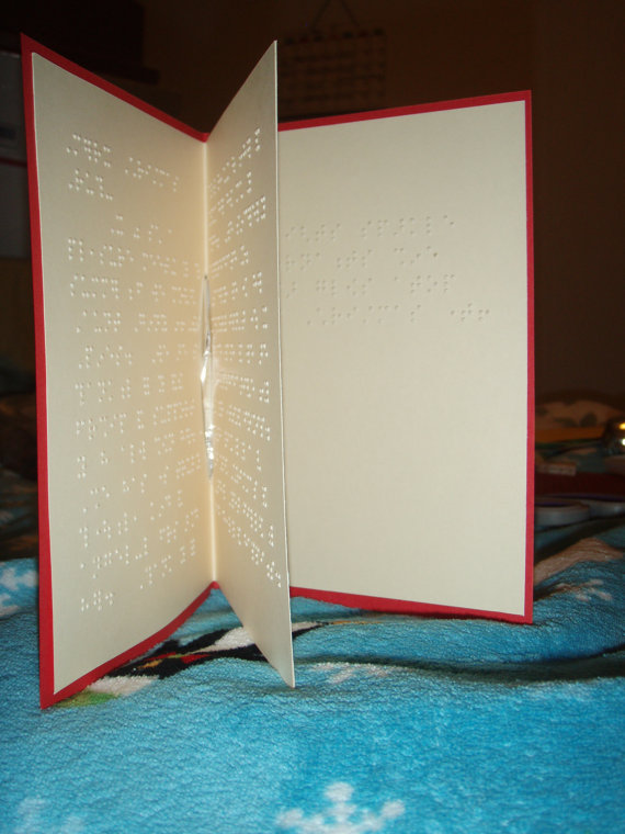
REALLY need accessibility? A braille invitation!
I know this solution isn't for you, but for anyone else who may be running into a community of Braille-readers, this custom greeting card in your selected color may be ideal.

Offbeat Wed Vendor
This page features vendors from our curated Offbeat Wed Vendor Directory. They're awesome and we love them. If you're a vendor let's get you in here!


