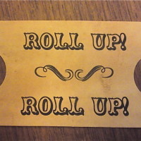
I just finished my Save the date cards and I wanted to share them with everyone… as I found it very hard to find details on how to do all the little bits!
Our wedding has the theme of “Vintage Carnival.” I thought I would share my photos and how I made them, also I'm super pleased with how they turned out.
Any questions, please ask me!
 I printed out carnival images in a collage stylee, then cut them in to my envelope template (I folded paper around contents). Then i used a wet tea bag and wiped all over the paper to create the vintage look! I got shaped scissors from Hobbycraft (really cheap) and cut around the edges.
 For the “ticket stubs” I printed a full page of these and just cut them out in to ticket stub sized pieces. I used a one inch hole punch for the cut out sides and, again, my handy tea bags came in useful! For the back-side of the tickets, I put out wedsite information (feel free to have a wee look). The image of little man came from a wingdings font from a free fonts website, all the strange little font men are featured a lot on our weddingy things.
 Vintage National Park save-the-date posters
OBT member Alaura got some really unique inspiration when it came time to create her STDs. “I discovered some vintage posters done in the 1930's... Read more

Here are the refrigerator magnets that we made — We are dressed as each other in the first one, was supposed to be cute, but I think it ended up being a little creepy. And the bridge in the second picture is The Forth Rail Bridge, we are getting married on the beach underneath it!
 We ordered magnet paper from a website and just printed them on our home printer. Then we used Microsoft Publisher to get them to look like photo booth strips, toned down the colour a little and cut them in to the right size.
 Here it is all ready to be sealed up! The paper was photocopied doublesided to include the clowns on the inside as a wee surprise when you open it up.

And the back with our return address stamp (free from Vistaprint!) and our stickers which we had printed at Vistaprint was also a little man from the wingdings font!


LOVE THESE!! but… how many did you have to do? our guest list is pushing 300, can’t imagine i’d convince anyone to help me with them!
Thank you! I cant imagine making 300!! I only had to make 40! You could give lots of people only little parts of it to do maybe? x
these are just fan-flippin-tastic!!! i love the envelopes – and the ticket stubs are so well done… and the magnets!!! i lived in Scotland for a while and that bridge is such a cool place to get married. did you know it was the first ever major structure in Britain to be built from steel?!! oh i just love these so much i want to come to your wedding!!! lol
Thank you so much, i love Scotland too and no i did not know that about the bridge, thanks! x
Probably a dumb question, but where do you write the address?
lol I had the same thought.
tee hee! I did worry when the words didnt show up first time but i used a Sharpie marker and wrote on the bit with the least pictures! x
Love this! What is the wingding font called?
Love the creativity of doing ticket stubs!
hello! Here’s where i found the font for free!
http://www.fontspace.com/search/?q=unca%20pale
Thank you! 😀
These look great!
Love love love these. I’ll definitely save this to inspire me in future projects.
Love love these! So very very cool and obviously had a serious lot of work put into them! ace!
Fantastic! Where did you get the magnet paper?
This is absolutely BRILLIANT! We were thinking of doing the exact same theme, but up to this point, nothing has come as close to what we want as this. And, the fact that you did it all yourself makes it that much more awesome. Again…BRILLIANT!
I am confused as to how you made the envelopes! Did you make your own? or use regular envelopes and glue this print onto them? What kind of paper did you use? I LOVE these btw!