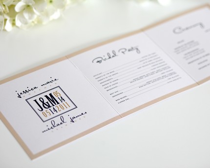
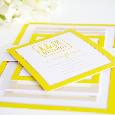
Shine Wedding Invitations is designer Autumn Wyda's baby. The store is a mix of her own personal style — sometimes ultra modern, sometimes classy and conservative, sometimes a little vintage-y and retro, but always clean and neat and not overly busy, is how she explains it. I just say WOW! These are rad and super hip. And also, me likey.
 Me likey so much that I've done a TOP 10 round-up of my favorite invitations, starting with the ones pictured above and ending it with the design that, would that I could, I'd pay for another wedding just so I could send those puppies out…
(As usual, click on the pictures to learn more about a particular invite)
 I love the colors of this invite. But, of course, like ALL of Shine's wedding invites, they can be custom colored.
Speaking of colors, these are some fabulous bright and colorful options…
 Wedding invitations from vintage to modern styles from Modern Girl Invitations
YAY! More fun wedding invitations to show of from Modern Girl Invitations! We've gushed about them before and I can't wait to show you five... Read more
I know a lot of you guys love damask, so I thought I'd show you these…
 And as you can see from this photo, each basic invitation set includes the invitation, choice of one enclosure, envelopes with printed return addressing, a belly band. PLUS they come with a complimentary postage stamp design.
 Shine also has the option for plenty of add-ons — additional enclosures, menus, programs (pictured above), table numbers etc. — everything you need from finish to start, plus custom requests if you need something special.
 But the most exciting add-on of all… Autumn does the guest addressing
for you (say no to hand cramps)!
 Here is the invite that won the award for “omg, why didn't I have this for MY wedding.” The nerdy equation/english nerdiness of this invite would have been a PERFECT combo for me and the hubs. UGH! Don't let your perfect invitation get away!


Nice, contemporary, slick stuff. Love the yellow ones especially. Almost makes me want to have invitations now. Almost.
I love these, so nice, fresh and clean 🙂
I do like these designs. Anything that strays from the “typical” way of doing things I am fond of. Well done.
The first ones (blue and orange scroll) are exactly what we want!
I’m still wondering which ones are the nerdy ones… they all look fabulous to me!!
The very last one (my favorite) is the nerdy one with the whole math equation theme.
Loving these – very cool and modern and great use of colour.
I agree, what do you mean nerdy? They all seem very cool to me.