
We had a bunch of fun (and some frustrations) making these pop-up invitations. I did the design and drawings myself, using Adobe Illustrator, InDesign, and Photoshop. The interwebz are a huge help with keeping design costs low. I got my background image free from Deviantart and most of the fonts free from dafont.com. I also got some cheap vector graphics from Etsy, but ended up not using those.
My future husband has access to a printer at work, and was allowed to use it for free. We did some test prints (this is important since there is no standard calibration of neither monitors nor printers. Proper print shops will usually do adjustments or tell you if something's off, and generally their printers will have better settings than your average office paper jammer). Then we spent about $30 on some decent paper (we could have gotten this a helluvalot cheaper on Ebay, Etsy etc, but were in a rush and had to shop at the local, over priced craft supplies store).
Here's how we made them…
What you'll need:
- Card/paper (we used 240 gms, if it's too thin and “bendy” it won't work)
- Scissors and/or a knife
- Ruler, preferrably a metal one
- Blunt knife or similar
- Paper trimmer (not strictly necessary, but it makes things so much easier)
- Glue of some sort (It needs to be fairy strong. I used a glue dot dispenser, but more ordinary glue or probably even double-sided tape could do!)
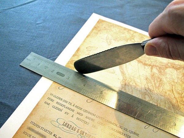
Step One: Fold the invitation
Thicker, heavier paper doesn't fold that well, and easily ends up looking wrinkly, cracked and generally herpyderpy. What you need to do is to score it. Or in other words: make a crease that will tell the fold where it needs to be. I used a ruler and a blunt knife, but you can use anything that'll make a crease without actually cutting the paper.
If you cut too hard it might break or tear the paper. If you cut too little, it won't fold nicely. This is a matter of trial and error. Bring coffee. Or tequila.
 How I made my swingin' pop-up invitations
Tribe member Melaina not only made these rad wedding activity books for the children, but she also made some seriously awesome pop-up wedding invitations. We... Read more
Then fold up the card carefully…
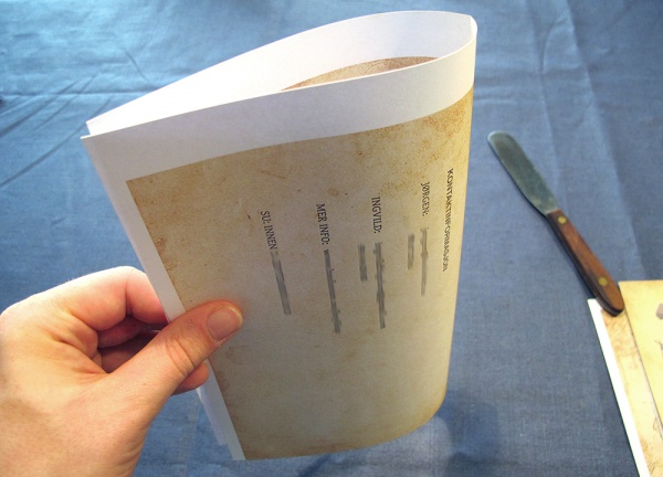 And squish the fold a bit.
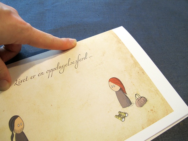 And it should be all neat and nice!

Step Two: Trim off the edges
If you've used a conventional printer you'll also need to trim off the white edges. We used a paper trimmer, but I forgot to take a picture of it. Sorry. But really: it's not brain surgery. White bits goes off.
Once that is done you should have a nice, clean invite!

Step Three: Attach the pop-up
Instead of cutting into the paper that makes up the invite, we simply attached the airship with a little strip of paper.
I added some lines in Photoshop to get the folds where they needed to be. It just seemed easier than using a ruler and a pencil, but ovbiously that is another valid option for the old-schoolers out there. I've numbered these in photo:
- C is the part that will be glued to the pop-up. D will be glued to the lower half of the card and A to the upper half.
- B and D have to be the same length, since they determine how far the pop-up sticks out from the card. Ours was about 1 cm.
Confusing? Yeah, I know. Don't worry, I'll show ya.
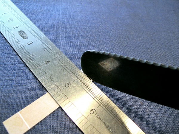 The strips need to be scored too.
 Then folded until they look like this. Glue C to the back of the pop-up, with the A end up.
 I also added some white lines at the back of the airship, to make sure the strip was attached at the right angle. Again, this can be done with pencil and ruler. Or even skipped.
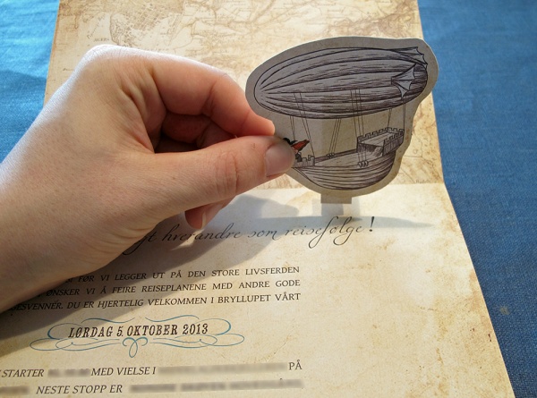 Glue D to the bottom half of the invite, pretty much edge to edge with the fold.
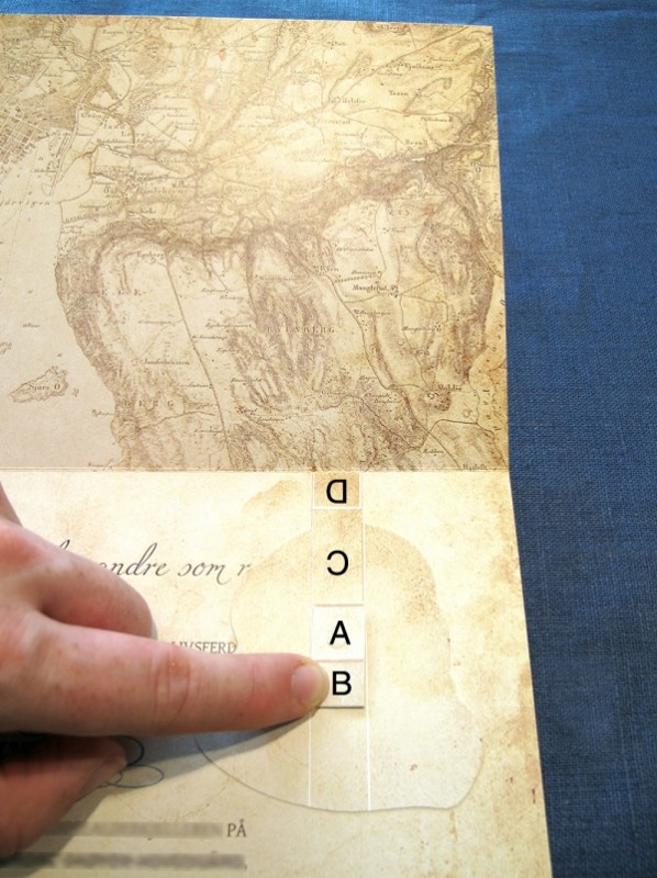 Then add some glue to A, and try to keep it in place while carefully folding the card over it.
 Give it a squeeze to make it stick. (And realize you're kinda facepalming your cartoon self.)
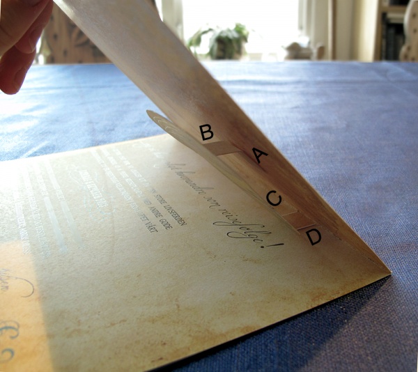 When you lift it up, everything should be nicely in place…
 …and BOOM! you have your pop-up invite!


Oh man, I love this! I’ve thought about pop-up invitations and it’s nice to know that such a simple pop-up can look stunning!
Do it! I don’t know what it is about pop-ups that make them so much fun. Maybe it’s the childishness? 😛
These look incredible! I bet everyone loved them!
Thank you! They did – the only negative comment I’ve heard so far was that they’re “hell to put up on a fridge”… 😉
Awesome! I was totally going to send out pop up STDs. There are other guides on the internet, but now I don’t have to go look for them. <3
hurr, durr, “pop up STDs”
(glad to be of help!)
OMG, I love this! Both the design and the pop-up 🙂
Thank you ^^
Hi Shovelbumbride,
I love love love your invitation and would like to ask if you can help us with our invitation. Understand that you are not exactly a wedding card designer but I seriously love this invitation of your design. I am living in Norway as well, so it would be great if we can be in touch 🙂
Hi, My daughter and her partner are getting married in November 2014. They have three gorgeous girls aged 8, 5, and 3 yrs ( my grandchildren). The girls and I are hoping to make their Mum and Dad’s wedding invitations and wedding cake. Any ideas please?
This is reeeaaalllyyy awesome! Thank you so much for sharing this. Btw, what kind of printer did you use for this?