If I get married again the ONLY reason I will have assigned seating at the reception is so I have an excuse to make place cards!
What you need:
- Heavyweight paper
- Pencil
- Sharpie marker
- Eraser
- X-acto knife and blades
- Ruler
- Watercolor paint (optional)
Start by cutting a 4″ x 4″ square of your heavyweight paper.
Using your ruler and straight edge, draw a light pencil line that bisects the square horizontally.

 How to make chopstick sleeve place cards
We made chopstick sleeves using some leftover travel-themed wrapping paper from our envelope liners. We then printed out each adult guest's name onto extra linen... Read more
Use your Sharpie to draw a simple design. Make sure your drawing overlaps that center line! I did a heart design and a number 11 design (as in, sit at table number 11).

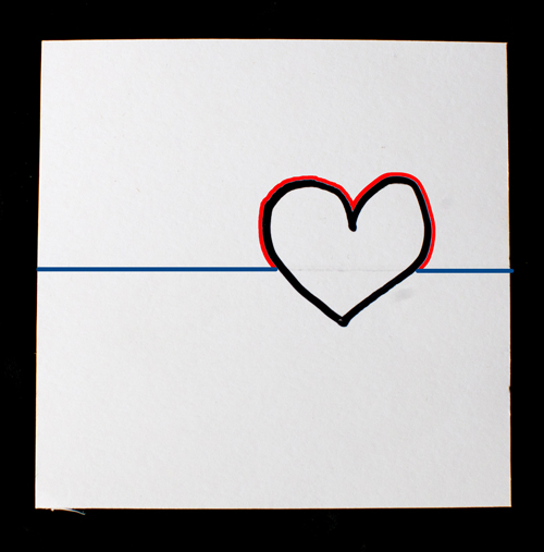
Now use your X-acto knife to cut the outline of your design, but only cut around the part of your design that is above the horizontal pencil line. Then score (lightly cut) the horizontal line, but DON'T score the part of your line that is under your design. For the heart design below, the blue line is where I will score, and the red line is where I will cut.

And I score the line using my ruler as a straight edge:

Now when I fold it in half it looks like this:

I clean up the card by trimming away the white parts along the top edge of the heart and by erasing the horizontal light pencil line that is still visible in the heart.

For the number 11 design, here is where I will score (blue line) and where I will cut (red line):

And here is the finished design:

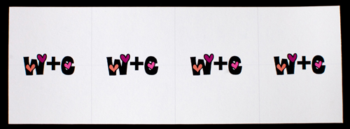
Now I've used my mad computer skillz to make a set of cards with my wedding logo.

This design is more complex and it is time-consuming to cut out. Also I have a lot of those white edges. Instead of cutting them away, I use my Sharpie to blacken the white areas.

I'd prefer a more simple design, especially if I were to cut out 50-150 of these suckers. Here is a heart design I made on the computer (again with the skillz). You can download a blank template here.

Once I cut them all out and use the Sharpie to clean up the top edge of the hearts, here is what I have:

Looks great, yes? But it would look even better with WATERCOLOR PAINT!

And why use just one color when you can use all different colors? Here is the result, I'm so pleased!

Happy creating! And as always, if you make this project, please post photos! And show them to me! I LOVE TO SEE WHAT YOU MAKE!


“… the ONLY reason I will have assigned seating at the reception is so I have an excuse to make place cards!”
Haha–this is me, too!
Lovely idea, and so deceptively simple!
I LOVE the deceptively simple projects! Cute and clever! 🙂
These are awesome!! Will try them myself! 🙂
SO CUTE!!! I may just have to do this! Love the idea, thank you! 🙂
Looks great! Hmmm…maybe I’ll use place cards at my next party…just because 🙂
This sort of thing may get used for food and drink info at our wedding! Labeling pizza types and other foods, and desserts. 😀
They look great !!! I just might use them myself 😉
Also thanks for giving us ideas to make stuff ourselves but still using the computer, coz over 100 guests “hand”made just isn’t possible anymore… Would you happen to have any tips on how to make cool computer-printed invites too? Thanks again !
Off the cuff I’d say you could spruce up computer-printed invites by using fancy paper, having some painted elements (watercolor is fast and easy), and/or using scrapbooking punches (http://tinyurl.com/4a8mtgr). I’ll definitely keep this idea in mind for a future DIY post, thank you!
Thank you very much for the advices Whitney 🙂 And for DIY that doesn’t require an Arts Degree ;p
That is so cute and what a great activity you can do with your posse before the wedding!
One of my facebook friends had the idea to use a bird as the pop-up shape. It will look like the bird is perching on top of the place card! Love it.
Ok so I am totally going to use this to label foods at my movie pizza party this weekend 🙂
OMG! Amanda Hagood is my wedding photographer. I <3 Whitney Lee Photography. These are adorbs!
Haha, yes, I am! Did you know Whitney wrote these awesome posts? Can’t wait for your wedding!
EXCELLENT tutorial, thank you for sharing. much better than the run of the mill printer’s cards with gold embossing.
Hi!! I’m totally doing this for my wedding. Here is an awesome idea my fh had… we’re going to use colors instead of table names… so the color we make the heart is going to be corresponding to the table that the person/couple sits at. 🙂
That is SO COOL! Great idea!
This is really cute. I love the watercolored hearts! I think this is even great for all the non-brides out there who just want to make cute little notecards to send in the mail. This would be perfect!
I have completely stolen this idea.. but changed the hearts out for our wedding owl mascots. I can’t figure out how to post the pic, but believe me.. they are adorable!
Whitney ~ I was just curious what template or computer program did you use to create these? I love them, but since my wedding has nature theme to it, I was thinking of doing leaves.