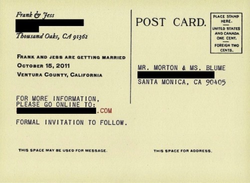
You have got to see Jessica's vintage Post Office-inspired wedding invites. Being a super crafty chick, she made these babies herself. They'll blow you away.
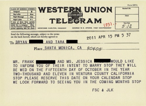
We've been designing all the paper goods ourselves, and printing them ourselves at our local Kinko's. That's how me made our telegram Save the Dates.
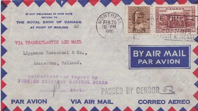
Then it came time to do our envelopes, and we really loved the look of this 1940 Canadian Airmail envelope:
 100% homemade, recycled paper wedding invitations
I sat around stressing out over what kind of image I wanted … I knew I wanted to do it myself but had no idea... Read more
But when we handed our envelopes to the Kinko's employee, she shook her head and said they will not print on envelopes because the back flaps might ruin the machines.
Fair enough. TO THE SHITTY, ANCIENT INK JET PRINTER!
Basically, after a lot of frustration and attempts we came to the conclusion that our ink jet printer would not do the pretty border at full bleed, so we resigned ourselves to just printing the addresses on them and then I would hand-stamp the borders.
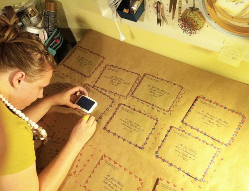
But I'm really glad it worked out this way, because I think the effect looks better than what a printer would have mimicked, and I can't wait to share these with our loved ones!
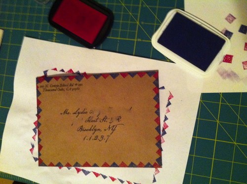
(Through the whole night I kept remembering that part in The Little Mermaid where Sebastian gets all huffy and says, “If you want some-ting done right youuu got ta do it yarrself!” SO TRUE.)


My fiance and I were going to do telegram save the dates…then we fell in love with library card save the dates. Too bad I can’t have two weddings so I can use both! 🙂
Smiling at the Sebastian quote (which my brain played out exactly as you had intended). Smiling even bigger at what you created – those are absolutely lovely, charming and original!!
So creative and unique. Time well spent! They look fantastic! I’m a graphic designer and did my own too. Much more satisfying 😉
Such a cool idea, makes me wish i was getting married again!
Beautiful! I love this idea. And what font did you use to address the envelopes? (or is that calligraphy?) I would love if you could share that information!
That is definitely a font, my caligraphy looks pretty bad! The font is called American Scribe, I just love how it looked on our kraft paper envelopes.
I’m so glad other people have an imaginary Sebastian in their heads <3
These are awesome!! I would have never thought of this – very impressive! 🙂
Fabulous! I’m making vintage postcard style invitations, planning to buy some cream coloured card stock and print them double-sided, four to a page, with a laser printer at work, then use watercolours to for bits of colour 🙂
Sounds gorgeous! If you’re a Tribe member be sure to show me when you’re done!